

Website redesign and branding package
Role
Branding
Product Design
UX research
Concept and Prototype Design
Concept Testing
Timeline
August-October 2024
Project Type
MVP, responsive web design, brand package
Deliverable
An updated, modern website designed to showcase the photography portfolio of Leah’s Loving Light Photography. The sight highlights the the photographer’s best work with large, vibrant images, and smooth navigation. An intuitive layout, easy access to the portfolio, client galleries, and a clean contact page it offers an effortless user experience. Potential clients can seamlessly browse through galleries, learn about the photographer’s services, and get in touch directly.
Impact
An enhanced portfolio presentation representative of this brand with a mobile iteration that increased user experience for existing clients, and converted more visitors to clients.

New brand package with a stronger brand identity that better aligns with the business goals and values- more accurately portraying the business to the clients and increasing conversion rates.

or continue scrolling to read the full project journey
00. Project Background
-
This small business utilizes a plug and play style website builder that has not been user friendly for the business, resulting in unfinished sections and poor brand representation. Lacking a specific focus, goals, and brand identity has been negatively impacting the number of bookings and growth for the business.
-
Leah’s Loving Light is a photography business from a passionate, spiritual photographer who wants to uplift people with their craft. In the last quarter they sustained a complete halt of foot traffic with no new client retentions. Seeking a new website to better display their portfolio and increase business, we began analyzing how we could work together to make this better for their business.
-
Current target users are individuals and families looking for lasting keepsakes of stages in their lives. High school senior photos, and family photography are the focus of Leah’s Loving Light Photography.
01. Preliminary Research & Discovery

1. Evaluation
Better understanding the goals and focus of this small business was necessary in getting a handle on where we were starting and where we wanted to go. I began with a thorough evaluation of the existing website. Because the existing products lacked clarity, focus, or brand recognition I met with the owner several times to discuss specific concepts, business practices, and goals.

2. User Interviews
I engaged with users, asking open-ended questions to better understand what is important to them when looking for and booking a photographer for special events. I also wanted to learn more about how they felt about the current website and business, so I followed up the generic photographer questions with specific questions related to Leah’s Loving Light’s online presentation.

3. Brand Design
Creating comprehensive, recognizable branding for this business was paramount to attracting new clients and communicating who this business is serving and what they represent and value.
Previous website

Uncurated- overwhelming pages showcasing strongest work mixed with many others that do not display strong technical execution or a sharp focus, and include poor exposure or color balance

Incomplete- galleries with nothing in them, or lacking cover photos lacks professionalism and undermines the public appearance of the brand

Unfocused- extraneous functions, folders, and image files unrelated to the brand’s focus and specialty
Key Insights
Business has not defined branding and focus, portraying a generic image. Combined with website difficulty this has demonstrated a lack of clarity and professionalism to prospective clients resulting in a complete halt to incoming business with no new conversions this quarter.
Users shared:
Existing website is generic and lacks personality. It is unclear who this photographer is and what they focus on or if they focus on photography at all.
Incomplete galleries and portions of the website look unprofessional and unpolished, portraying a negative image to perspective clients and making navigation complicated for existing clients.
Uncurated galleries are both overwhelming and underwhelming to users with the desktop website showing every photo on the website mashed together and mobile versions having almost no images filled.
Missing functions are stopping clients from being able to complete necessary steps to book a session and send messages to the business.
02. Conceptualization
Using these key insights, I created a list of objectives to ensure clients were able to have their immediate needs met by the function of the website before I focused on aesthetics and branding. I conducted a card sort to see what made the most sense to users in creating the layout.
Design goals:
Stronger presentation of business and align website focus
Continuation of sections that are well organized and impactful
More curated imaging with purpose
Ensure users are able to book a session
Make it simple to send messages to the business
Allow existing users to navigate simply to their personal galleries
03. Development
I created and tested low-fidelity wireframes to gauge how users were responding to the new layout and content. I tested three task flows against specific success metrics, and the results were successful. This showed me some specific things I could modify to enhance user experience, and also told me I was on the right track.
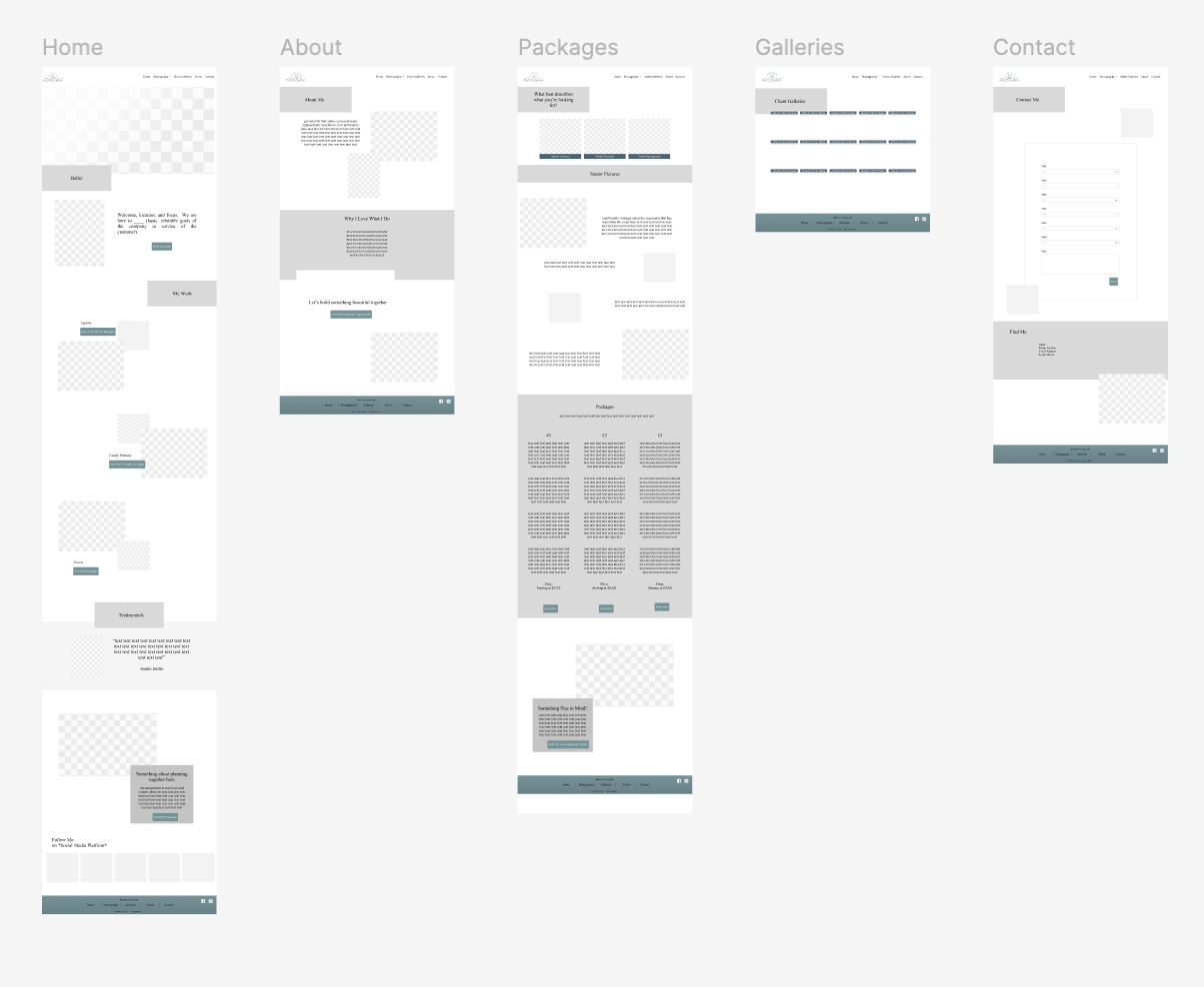
Sample of wireframes
Branding
After a branding concept meeting with the photographer I created:
Brand archetype: everyman and caregiver
Brand adjectives: empowering, loving, fun, inspiring, encouraging
Values: motivated to provide reassurance, service, advice, and support to others
Brand colors: blue (for strength, dependability, tranquility, peace, and integrity), turquoise (for spirituality, calm, and serenity), and white (for balance, freshness, and light)

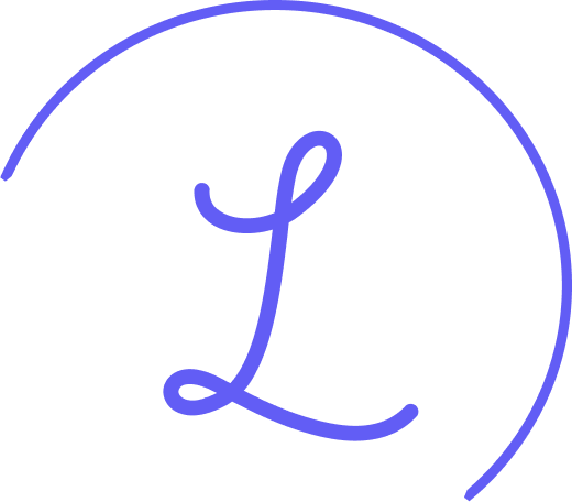
Logo Design

I wanted to ensure the logo was simple, timeless, and tranquil to allow the business to grow and change without outgrowing its logo.
The components of the logo design:
During our discussions there were many repeats of three’s (three different components of the business in her long term goals, as an example). When creating her logo, I kept the concept of 3 as a visual representation of where she' has started and where she wants to go.
Easily recognizable and would transfer to all aspects of her business as it continues to grow
Soft, clean shapes convey the everyman and caregiver archetypes her brand portrays and can easily be shown as parts of the whole logo and in different color schemes
Options that didn’t make the cut:


04. Iterations & Usability Testing
Previous participants and new participants were used for another round of user testing. Evaluating how easily and accurately they could navigate, and gathering their opinions on the UI and branding components added to the mock ups.

Success metrics:
90% completion rate of task within 2 minutes
Fewer than 5% of users encounter significant difficulty (errors, major navigation issues, etc)
Achieve an average user satisfaction score of 7 or higher (out of a total of 10)

Usability test findings:
100% completion rate of task within 2 minutes
100% of users navigated immediately to the correct page, 2 users initially struggled with understanding to interact with the prototype in order to complete the task
users reported an average of 8/10 in reporting how easily they were able to navigate the website
Areas of improvement:
Homepage scroll is too fast- Figma prototype can not be slowed beyond this point, will modify the way it functions
One mention of inconsistency in border radiuses. They were all done with a style preset, but will double check
Specific lead pages rather than all of the photography options at the beginning of each page- i.e. eliminate the top portion of each of the photography pages. This was carried from a previous layout, so it makes sense they would be confusing now
Before and afters
Client galleries before

Client galleries after

About page before
About page after

Home page before
Home page after
What the owner said about the design and rebranding…
“This design means so much to me, it highlights my work and showcases my personality. It is everything I wanted. Laura was collaborative and inviting with great ideas that made me comfortable to work with her”
-Leah
06. Deliverables
Clear layout and consistent design- easy to navigate, and clearly portrays the personality of the brand
Streamlined features- focused, purposeful, straightforward features reducing cognitive load for new and existing users